Unbeknownst to my friend and fellow photographer David Marshak, who’s taken classes from me and has heard me talk in several occasions, he gave me the answer to this question. He recently sent me a link to a Vanity Fair video in which director Rian Johnson breaks down a scene of his movie “The Glass Onion: A Knives Out Mystery.” David wrote something that humbled me and intrigued me at the same time, “I think it is a master class of composition… it made me think of what I’ve learned from you.”
I watched the short video, just shy of 20 minutes, one time straight through without pausing it. Then I watched it several times while pausing it and taking notes.
In the end, I found it fascinating, and I came up with the same conclusion as David- at least the part about it being a master class in composition.
Listening to a master storyteller like Johnson as he breaks down a scene will enhance your understanding of composition as a photographer. So, pay close attention to how he describes specific takes/ frames, and keep in mind everything he is talking about can be applied to your photography.
I would suggest going through the video once and then watching it again while focusing on the below timeline notes. Or feel free to simply go back to the specific points I’ve singled out. Especially since these are the parts that pertain directly to photography.
To help you out, I’ve included some of my photographic examples where I have used the same principles of grouping, composition, lineup, etc. However, since most of what I do nowadays is Street Photography, instead of setting up a scene, what I aim to do instead is to find these elements freely and spontaneously occurring in the world around us.
PHOTO NOTES: The ‘ denote minutes and “ denote seconds. The words in italics are what Johnson is saying at the exact moment I want you to pay close attention to his description of what he did, how he did it, and why he did it.
– At 55“ “… first shot, day one“: Analyze Johnson’s beautiful shot of the pier/ jetty and notice the clean lines, the clean background, and the great silhouettes. More importantly, notice how each compositional element occupies its own space. These include the still-life elements such as the lamp posts and the human elements like Benoit Blanc, played by 007’s Daniel Craig, sitting down atop his luggage. And, even the arriving second character in the scene stands out clearly from the background.

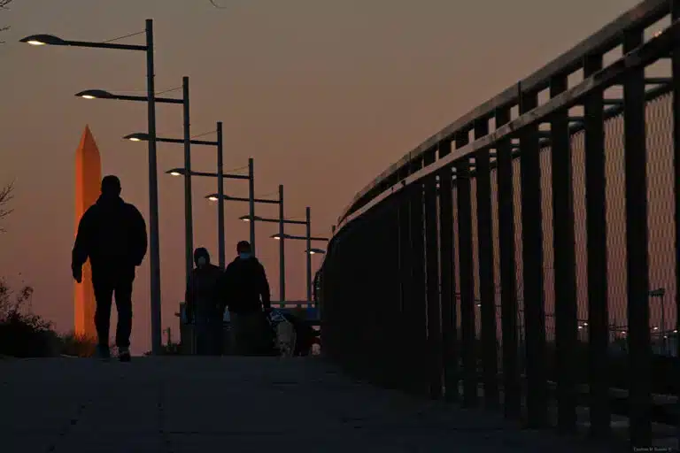
When I made this photo of people enjoying the warm weather on a pier in Croatia, I used the same principles of composition he used. Clean backgrounds, and as many individual compositional elements as possible occupying their own space within the frame.
– At 5’55” “…all the gazes leading back to Birdie.” The character Birdie, played by Kate Hudson, occupies the center stage of a complex composition. She is framed by two characters. Finally, the fourth and lesser character in the frame is a visual afterthought of sorts that makes you linger just a little bit longer in the frame.
– At 10’08” “the shape of her hat defines the frame.” This is a conscious decision to allow the Birdie character to take center stage and to allow for the big hat to occupy so much real estate within the frame. This is a brilliant choice by Johnson and it requires a keen awareness of the frame.
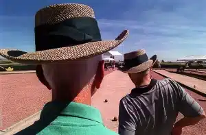
Deciding how much a specific element, i.e. the hat, occupies within the frame is your choice and as such, it deserves thoughtful consideration.
– At 13’47 “...means the actors need to be precise.” What he is talking about here is about creating a “properly layered” and perfectly designed image with a first layer or entry point, and the subsequent layers (defined by the different characters), which in turn lead the eye to go deeper into the frame. Ergo, you spend more time in the frame, which at the end of the day should be your ultimate goal: To make people spend just a bit longer looking at your photos than at all the other visuals we get bombarded with daily.
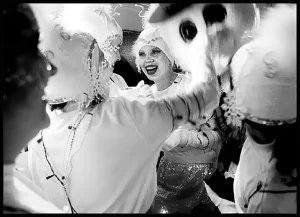
This layered image of young girls behind the scenes at a school holiday performance was composed in a precise manner and in such a way that all elements lead to the one girl facing the camera.
In the fourth quarter of the video, Johnson goes deeper into storytelling. However, he might as well be talking about the principles of how to properly create a photo essay.
As a reminder: In photography, when you want to tell a cohesive story with your photos you need to have:
1. Wide-angle shots: These are meant to be all-encompassing shots. The type that gives the viewer/ reader a sense of place.
2. Medium shots: These types of shots showcase how people interact with each other and with their environment. But the focus is primordially still on the people.
3. Tight/detail shots: Finally, these are the kind that makes you notice the specific features or characteristics that make a place or a situation unique.
– At 14’14” “…vroom, vroom… POW, POW!” This is a brilliant scene that starts with a predominant foreground element, the luggage. Then the wide shot shows the overall scene. From there, he transforms the scene into a medium shot where the characters of Duke Cody, played by former pro-wrestler Dave Bautista, and Whiskey, played by Madelyn Cline, occupy the frame while interacting with each other and with their environment.
– At 15’26” “I love that insert shot.” Here he is talking about the third element of this triumvirate of story telling, a detail shot, which in moviemaking is called an “insert shot.”
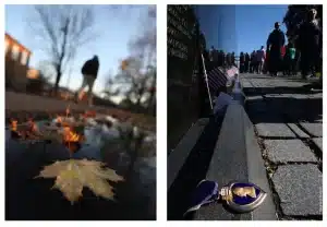
Be it a detail as common as a fallen leaf during Fall season or as unique as a Purple Heart medal left at the Vietnam Veterans’ Memorial in DC. These are the types of shots that will help you add texture and mood to the story you are trying to tell.
– At “16’02” “…keeping Blanc alive.” This one single frame where you have two characters on the same plane but leaving space between them in such a manner that Blanc still occupies center stage in the background. BONUS: Even in that shot, the pole in the background is not coming out of Blanc’s head.
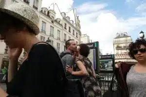
Friends greet each other in Paris as they meet at a subway entrance. Notice how I purposely surrounded them with other subjects, yet the image is composed in such a manner that you still know the photo is about the kissing couple. In the words of Johnson, I keep them “alive” by allowing other compositional elements or subjects to surround them but not to overshadow them.
– At 17’50” “…how they relate to each other.” He’s talking about keeping relationships obvious to the viewer by grouping subjects together. This is a perfect example of how to stage a group portrait shot where you have to decide who stands by whom, and who else stands by someone else.
When it comes to the best way to create a photo, or a scene and how to tell a story, all visual arts share the same characteristic. Be it in the single frame, or in the multiple frames needed for a photo essay, or in a sequence of moving frames, great composition will always make your photos stand out.
–

